Countertop microwaves in general have many opportunities for improvement. At the outset of the project, we were tasked to redesign the countertop microwave to give it a unique look that sets it apart from the competitive set. These images are a great example of many brands offering up very similar looks in a multitude of price points. My goal was to align the team on the scope, and craft a project that gave the shareholders of the project confidence in the design work.
Research for this project consisted of reaching out to our consumer insights team for information on our target customer, getting up to speed on housewares trends from the International Housewares Show, and refreshing on the color trends within housewares. The main kitchen trends that were articulated to us were:
-The Live-In Kitchen
-Living Within Our Means
-The Green Kitchen
-The Wellness Kitchen
-Cooking for Fun
We also found that 40% of consumers were millennials, and another 40% were baby boomers. The biggest insight from this information is that we had the opportunity to be playful with the design. We needed something that could stand alone in a conservative environment, but also be flexible to accept color, texture, and graphic exploration.
After digesting all the information from research and fully aligning on the project scope, I organized a design team workshop exploring visual concepts. Focusing on the brand opportunities, we narrowed it down to six directions. I took each concept and roughly built them out in CAD to insure the form was accurately captured for review.
1- Sleek
2- Simple + Modern
3- Durable
4- Sweeping Surfaces
5- Pattern + Repetition
6- Whimsical
Once reviewed, the team zeroed in on concept 6 and concept 4. I then took the concepts and built out our proposed construction in SolidWorks. Below, I used these illustrations to present my thoughts to both the design director and the technical lead on the projects. Through a collaborative workflow, I refined the concepts into machinable forms for prototyping.
Concept 4 was my personal favorite by remaining simple and clean. This design also presented many opportunities for color, material, finish (CMF) studies.
CMF Studies
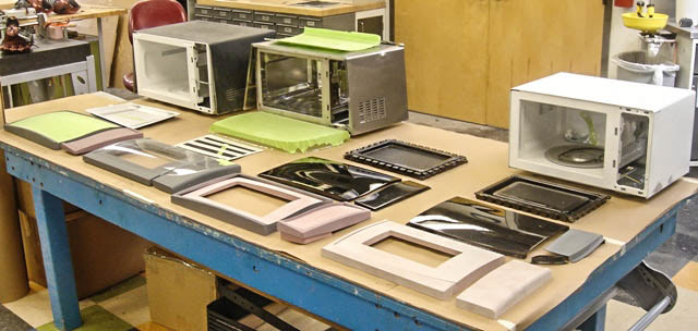
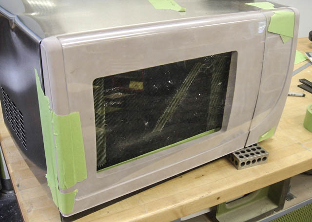
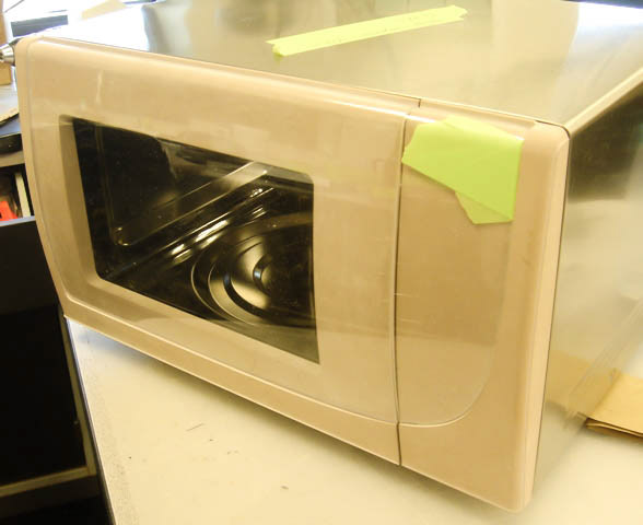
Images of the various models built


After undergoing qualitative research sessions, and conferring with the team, the color theme went back to a more conservative approach. We refined the form and finalized the design with this model.